Hmm, I tried fixing that but in the end I got the boxes to expand and contract. Working on the text. One script uses tables and the other uses divs. FML I blame the long thread titles.
Little better, but i was thinking of shrinking the forum a little, like 32 pixels, and making the hot topics a little wider. The thread titles are all squished.
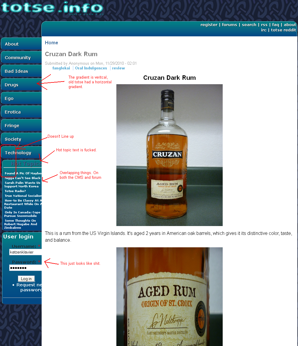
Where the fuck is clover? We need a hot topics that shows bumped threads!
If I move this to the right then users like Katz can't really use the forums BUT that doesn't mean we won't have a different layout as well.Okay, Hot Topics and Rss bar color fixed, font fixed. Gradient needs work but it's a webkit and I don't want to mess this up. I will increase the width anyway.
We could always have two themes, one on the left and one on the right. Make the right one default though because it makes the best use of screen space.
^To add to that, we need a big button that is easily seen to direct people to the forums. I remember when I found the old TOTSE, I wasn't even aware that a forum existed until it shut down.
I don't I can add sub domains for a nodes. I mean I haven't tried it yet. The CMS using dynamic categories. You just have to use few keywords. I was looking for some Category types and in the I found that by using the tabs <-- on the left I can link directly to the articles and yes CMS is in development as we speak.
bbs.totse.info already points to this place but not to the bbs. [www.totse.info]
Moving on, I agree with vineman and I already added the changes.
Okay I tried adding categories etc but that only makes editing more difficult. We're using free tagging which makes it easier to search any content. By user, by type etc.
You mean like how the cms is at the bottom of my screen?
That my friend is due to your resolution but if the forums display fine on your screen then the cms should be too. But in any case I will try lowering the width etc
Use the mobile theme [style 3] or the old layout [style 2]
I am asking some devs about the best way to resolve this. Whenever you're dealing with dynamic content and different resolutions it's always a bitch to find the perfect sweet spot. Also, we're kind a modular when it comes to template which helps me make new template in minutes with minimum editing. I am thinking of doing a fixed layout style that should work best with lower resolution or using absolute positioning.
I talked to Zok and I lol'ed when he said he hates designing. That explains why he used the simplest approach and fitted everything on a menu. I can do that easily and maybe I will do it for the mobile theme but we have to like match Totse layout and that makes things a bit difficult. You see Jeff used tables. And those tables are mapped throughout the page just like the forum but when it comes to div it automatically adjust using the browser window.
Now, to fix this problem I can set a width like 960px and then whenever users open Totse they will get a scrollbar [horizontal] if the resolution is smaller or a fixed layout. Now, I imagine browsing Totse on an 1080p display. That will look like a tiny window.
Oh btw this is me talking to my inner me using this post. Consider this like an internal debate.
Okay, we can make a new layout and call it Hires whatver and then use the modular layout which works on percentages and then we can add another layout that basically uses pixels and restricts everything. So no matter what the Window size the forum doesn't change.
Now, I know we can add min-width option in the body and restrict the reszie element we can also add that property to the main forum body but again that doesn't work on IE.
Or I think you should try this Dfg, lower your resolution and see how the screen looks. This will give you a first hand idea of what other users are previewing.
OMFG, dude I love you, you're freaking awesome.
Hey, I am Dfg after all.
Okay, bro I will try this. Anything else?
Yeah, next time avoiding doing this discussion in public.
Okay that should do it. I am browsing at 1024*768 resolution and both the CMS and forums work fine now. There were some HUGE problems here and there but thanks to Dfg my man and his idea of lowering resolution, I finally fixed it.
If you're using 800*600 use the mobile theme. Anything higher than that, use the old or default theme. Same applies to the CMS.
To get around it, I have to use a proxy server with javascript disabled.
Use the mobile theme and see what happens. I think it may be due to improper download of the CSS file etc. Just reset the cache and try accessing again.
 Katzenklavier
Regular
Katzenklavier
Regular
Comments
Sure, everyone can bitch.
Also, is it possible to remove the feedburner logo?
Link is http://www.feedburner.com/fb/images/buzzboost-pwrd.gif in case you need to know what image it is.
It's quite possible to hide it but it's part of the script. Plus, it's Google.
<style>
#creditfooter
{display: none;}
</style>
There, paste that after the feedburner script.
Oh, and is it possible to have the right side of HT and articles flush to the edge of the forum like the tabs?
Where the fuck is clover? We need a hot topics that shows bumped threads!
I am going to sleep. Will fix more things later.
Shit's not working. They're still enormous.
<--
<-- Forum looks stupid with shit on the left.
<--
<--
inb4chester
Holy shit, why isn't the cms aligned well in your screen!
Fixed I will fix the screen issue after some sleep.
crime.totse.info
drugs.totse.info
porn.totse.info
tech.totse.info
ego.totse.info
society.totse.info
Then do this for subcategories.
society.totse.info/conspiracy
society.totse.info/law
etc...
also; bbs.totse.info
bbs.totse.info already points to this place but not to the bbs. [www.totse.info]
Moving on, I agree with vineman and I already added the changes.
I found some CSS conflicts on the cms btw.
You mean like how the cms is at the bottom of my screen?
That my friend is due to your resolution but if the forums display fine on your screen then the cms should be too. But in any case I will try lowering the width etc
Use the mobile theme [style 3] or the old layout [style 2]
I am asking some devs about the best way to resolve this. Whenever you're dealing with dynamic content and different resolutions it's always a bitch to find the perfect sweet spot. Also, we're kind a modular when it comes to template which helps me make new template in minutes with minimum editing. I am thinking of doing a fixed layout style that should work best with lower resolution or using absolute positioning.
I talked to Zok and I lol'ed when he said he hates designing. That explains why he used the simplest approach and fitted everything on a menu. I can do that easily and maybe I will do it for the mobile theme but we have to like match Totse layout and that makes things a bit difficult. You see Jeff used tables. And those tables are mapped throughout the page just like the forum but when it comes to div it automatically adjust using the browser window.
Now, to fix this problem I can set a width like 960px and then whenever users open Totse they will get a scrollbar [horizontal] if the resolution is smaller or a fixed layout. Now, I imagine browsing Totse on an 1080p display. That will look like a tiny window.
Oh btw this is me talking to my inner me using this post. Consider this like an internal debate.
Okay, we can make a new layout and call it Hires whatver and then use the modular layout which works on percentages and then we can add another layout that basically uses pixels and restricts everything. So no matter what the Window size the forum doesn't change.
Now, I know we can add min-width option in the body and restrict the reszie element we can also add that property to the main forum body but again that doesn't work on IE.
Or I think you should try this Dfg, lower your resolution and see how the screen looks. This will give you a first hand idea of what other users are previewing.
OMFG, dude I love you, you're freaking awesome.
Hey, I am Dfg after all.
Okay, bro I will try this. Anything else?
Yeah, next time avoiding doing this discussion in public.
Okay, boss.
If you're using 800*600 use the mobile theme. Anything higher than that, use the old or default theme. Same applies to the CMS.
Let's see if these settings scale well.
Reverting to original resolution.
*fingers crossed, penis tucked*
*pats himself*
To get around it, I have to use a proxy server with javascript disabled.
Use the mobile theme and see what happens. I think it may be due to improper download of the CSS file etc. Just reset the cache and try accessing again.